
The Club Natació Benicarló is a swimming club with a rich history.
Founded in 1988 with the objective of promoting base sport in swimming since the beginning, perfectionating till the competitions groups. Also developing initiatives in the social, leisure, and health promotion fields.
Across the years, this entity has developed a strong image, but with the new digital era, it needs to improve it, developing an entire brand that helps with it and its own new objectives.
The symbol
The symbol, present since its foundation, represents a person swimming butterfly style on four lines representing water. It has been geometrized, establishing the aspect ratio.
The type
An ode to our origins. Palau was an industrial company, which included the first swimming pool in Benicarló between its sports facilities.
The new typography is a tribute to our first swimmers.
Our colours
1 9
#014D8F
Our identity
8 8
#F5DF4D
Improved for new digital era
The new digital trends make it necessary to improve the brand experience. Introducing the new graphic plot, made with the elements that identify our sport.
In this way, the dividing ropes, the pool wall crosses, and the pool centre lines are being simplified and dotted with movement to increase this digital experience.
Every member is important
In the last years, with the closing of the local public swimming pool, the club have experienced changes in its configuration.
Despite the inconvenience caused fort this situation, the Club opened a small facility to ensure the future of the swimming until the hoped public swimming pool reopening.
Nowadays, the early bases of the Club, known as “Escoleta” (school in valencian language), are a very important part of the present and future of Club Natació Benicarló.
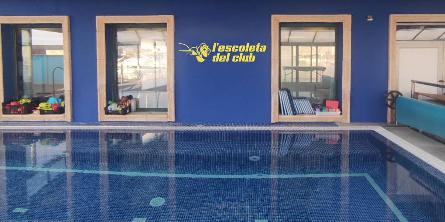
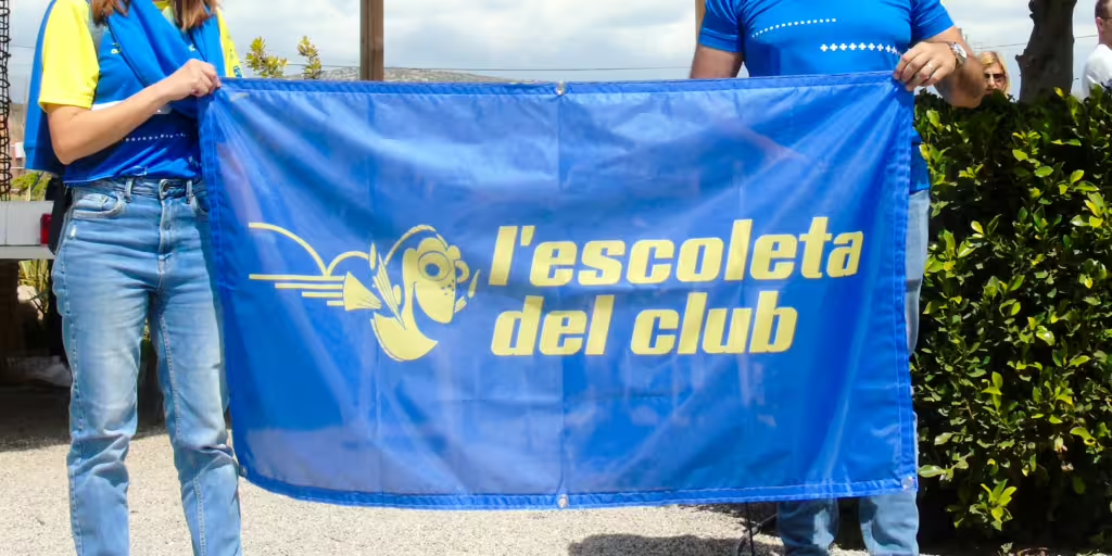
One of the actual lines of action is the promotion of this section and make its members to feel an important part of our Club. We create a specific sub-brand, “L’escoleta del Club” to publicize the activities developed on it and to effort the feeling of belonging of its members.

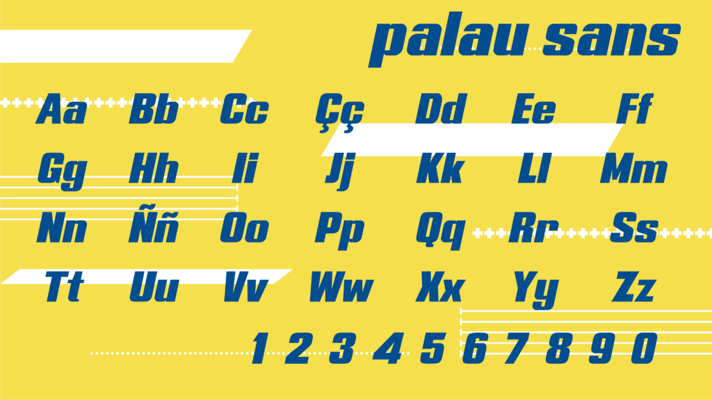
Introducing palau sans
Inspired by our very first origins.
The constructions of the first swimming pool in the city, part of the industrial facilities of “Muebles Palau”, supposed the first generation of big swimmers, and big competitions. The most important example is the organization of the Travessia Peníscola-Benicarló, which nowadays is our open water main event, part of our history and identity.
In a first moment, this element was not supposed to be made, but with the application process of the brand we realized that the entire typography would enhance the entire brand experience.
Following the characteristics that were defined for the typographic part of the logo, the new font will improve the brand experience in every element.

An equipment with our identity
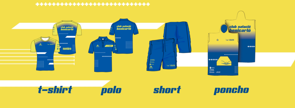
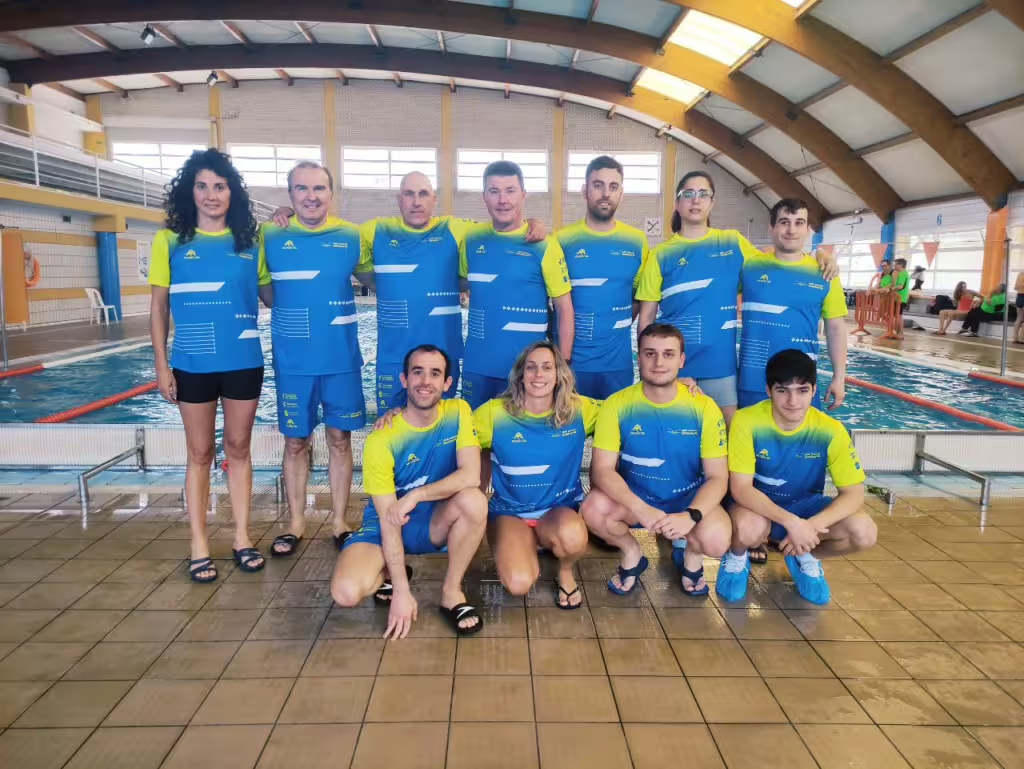
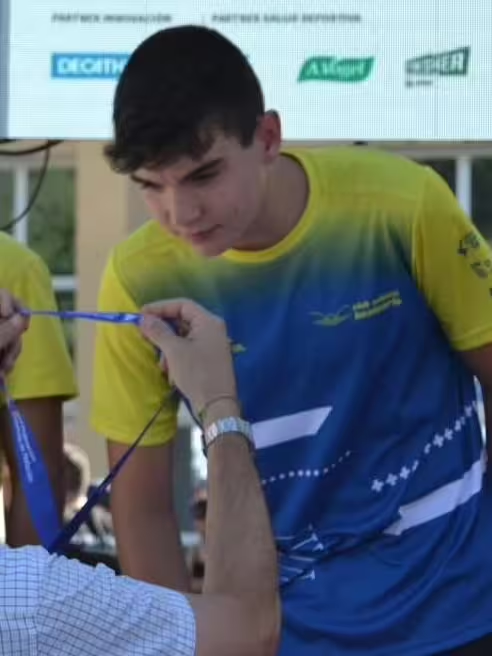
As any other sport Club, the equipment is a primordial element of its identity. It is the very first presentation of the Club to the outside and the first look that people will take.
On the other side, the Club was working with a brand that changes the equipment every 2 or 3 years, which made that there was not a clear identity in the equipment that was used.
With these requisites, we started to work on an equipment as timeless as possible, with possibility to replicate it without depending on brand catalogues, and responding to the visual brand that we created for the Club.
As a result, we have a fully printed equipment that reflects faithfully the identity of the team.
On the following months, more equipment elements will be presented.
Explaining the project
All this work needed to be explained to all the people which feel this Club as their own.
That’s why we produced a video explaining every change that we made in this project.
More information about this project on clubnataciobenicarlo.com.
